top

Position:

Lead UI/UX Product Designer

Project:

Donation Onboarding Experience

Company:

GIVTO Charity

Overview

I led the end-to-end design of Givto’s online donation onboarding experience, creating a clear and supportive journey for users—particularly those new to charitable giving.

The product was launched during COVID-19 to help charities adapt to the loss of high-street donations, enabling organisations without a digital presence to offer online giving, while enhancing existing platforms.

Objective

The goal was to design a simple, trustworthy onboarding experience that reduced friction, improved completion, and supported users unfamiliar with digital donation platforms.

  • Simplify the donation journey for first-time and non-technical users
  • Increase completion rates through guided, intuitive interactions
  • Build trust during sensitive stages such as personal details and payment
My Role

I led UX and UI design across the onboarding experience, working closely with stakeholders to align user needs with product and business goals.
  • Directed end-to-end design from research through to final UI delivery
  • Collaborated with product, technology, and marketing stakeholders to define requirements and success metrics
  • Translated user and business needs into clear, structured user journeys
  • Delivered responsive designs and reusable UI patterns to support implementation
1 / 2
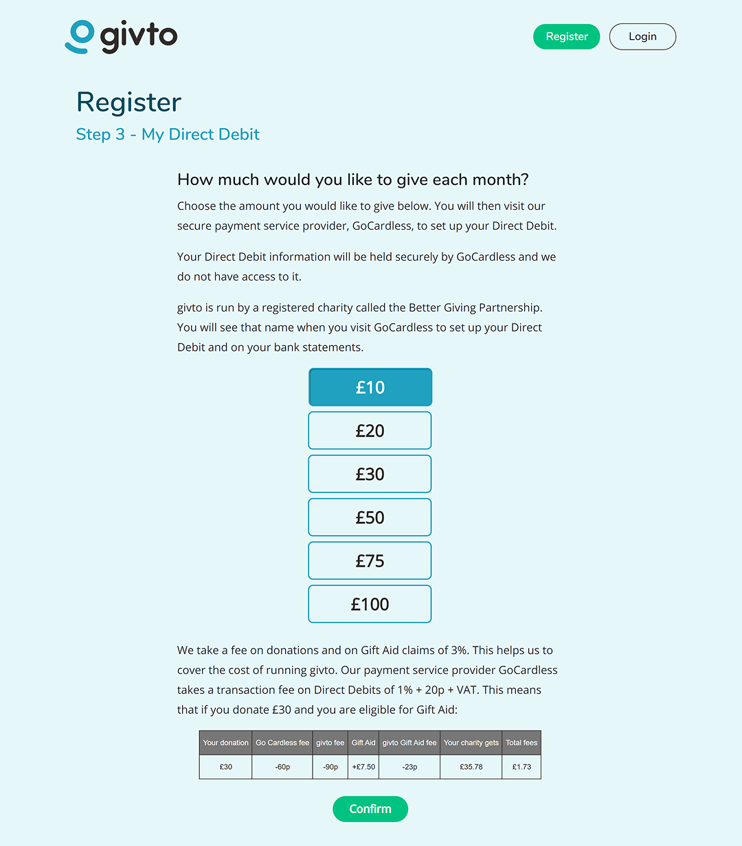
Splash Screen improvements
Original UI
2 / 2
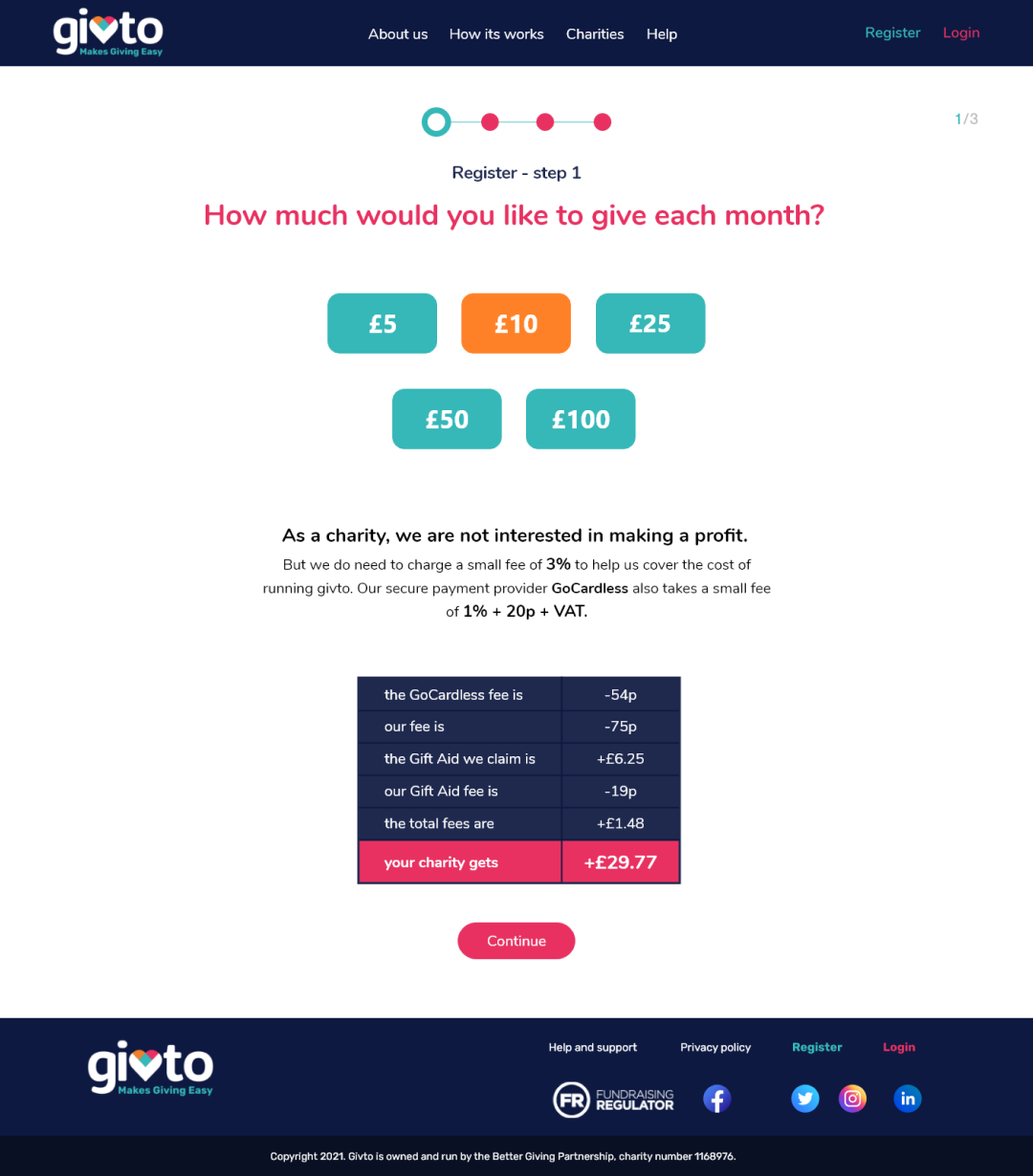
WIQ Success Screen improvements
New improved UI

Design Strategy &
Execution

Designing for Clarity & Completion

The design focused on reducing friction, improving clarity, and guiding users confidently through the donation process.

  • Structured progressive steps to reduce cognitive load
  • Added progress indicators to improve orientation and completion
  • Used supportive microcopy to guide key decisions and reduce uncertainty
  • Applied clear visual hierarchy and feedback states to reinforce actions
  • Ensured WCAG AA accessibility across all components
Splash Screen improvements
Make your Donation
WIQ Success Screen improvements
Add Gift Aid option
Splash Screen improvements
Enter details
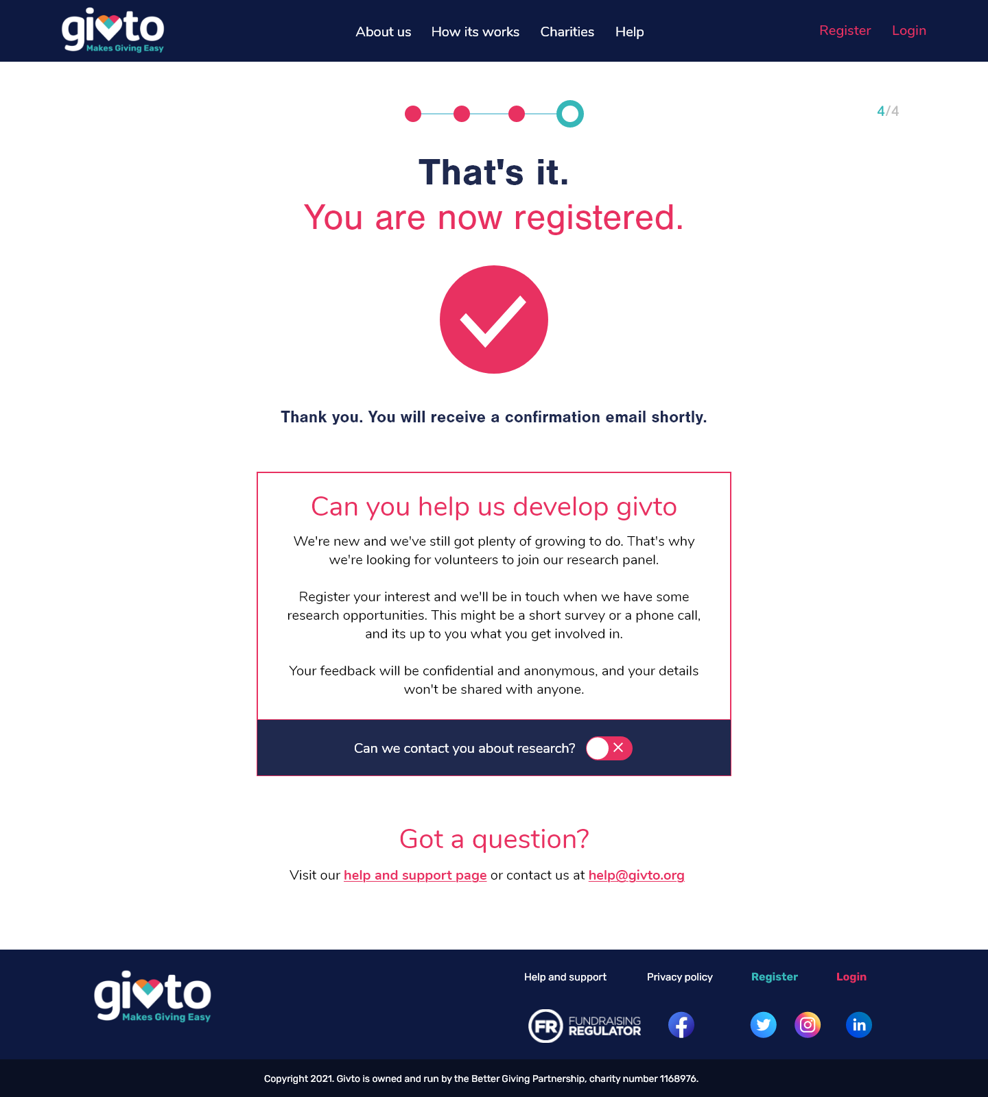
4 / 4
WIQ Success Screen improvements
Registration complete

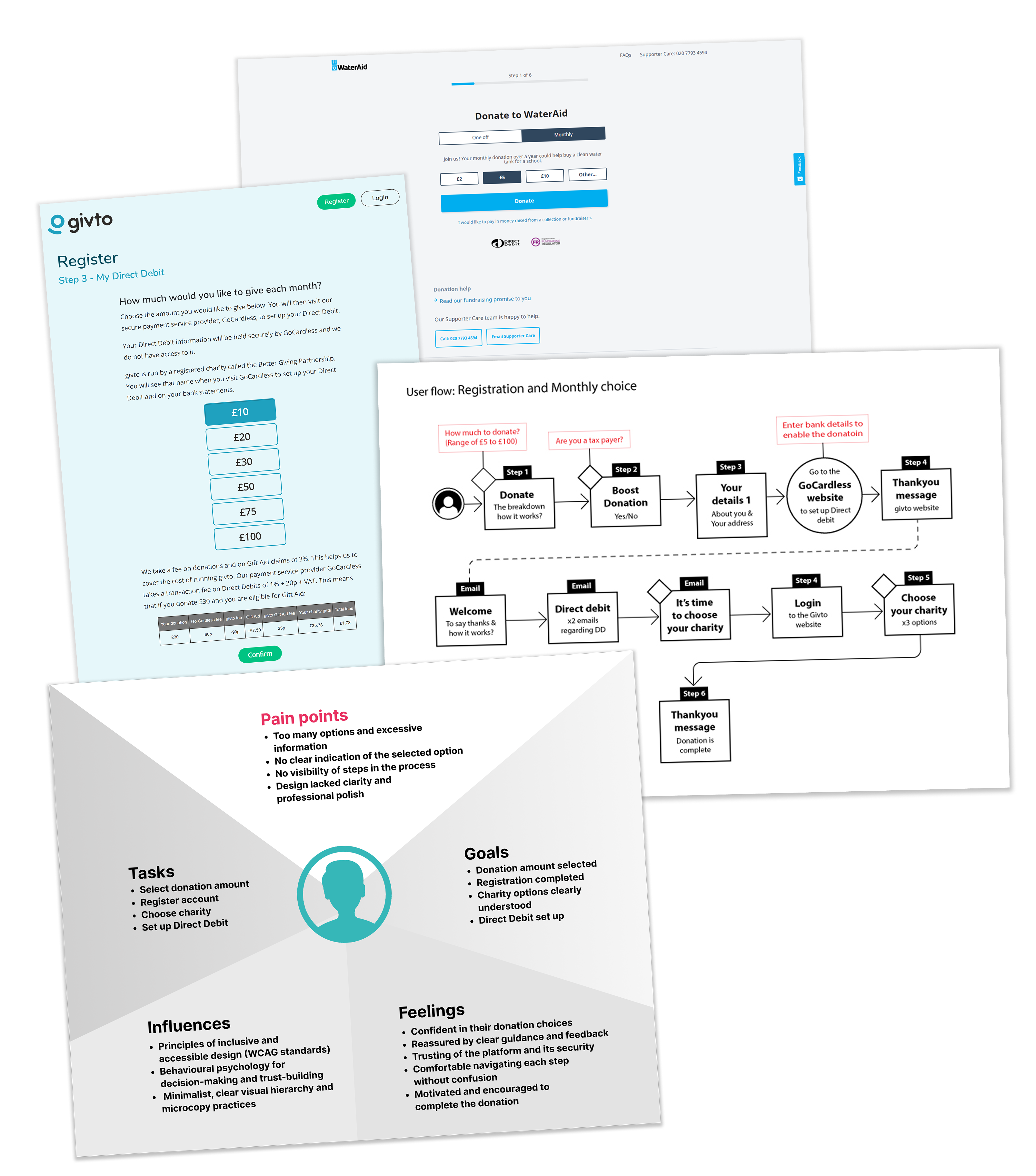
Research and Insights

Grounding the work in real user behaviour, I combined competitive analysis with persona mapping to inform key design decisions.

  • Analysed donation flows across leading platforms and charities
  • Identified best practices, friction points, and opportunities
  • Mapped insights to personas to guide design decisions
  • Ensured an intuitive, empathetic user experience

Design Approach

The experience was designed to reduce friction, guide users clearly, and maintain consistency across all touchpoints.

Clear, Guided User Flows

Breaking the journey into manageable steps helped users stay oriented and in control.

  • Structured the onboarding into simple, progressive steps with clear actions
  • Introduced progress indicators to support orientation and reduce cognitive load

Thoughtful UX Copy

Clear and supportive language was key to building trust at critical points in the journey.

  • Designed clear, supportive microcopy to guide users through key moments
  • Reduced uncertainty during data entry and payment stages

Visual Cues & Accessibility

Visual feedback and accessibility standards ensured the experience was inclusive and easy to navigate.

  • Used components, colour, and feedback states to reinforce user actions
  • Ensured all components met WCAG AA accessibility standards

Consistent Visual Language

A cohesive UI helped reinforce trust and made the experience feel reliable and familiar.

  • Applied Givto’s brand guidelines to create a clean, cohesive interface
  • Developed reusable UI patterns to support consistency and scalability

Responsive by Design

The experience was designed to perform consistently across all devices.

  • Designed a fully responsive experience across mobile and desktop
  • Tested layouts and interactions to ensure consistency across devices
Outcome

Improved onboarding clarity and completion through a structured, guided donation experience.

  • Improved completion rates across the donation journey
  • Reduced friction through progressive steps and clear feedback
  • Increased user confidence, particularly for first-time donors
  • Delivered a consistent, accessible experience across devices
  • Strengthened stakeholder confidence in the product’s usability and scalability

The work established a strong foundation for Givto’s digital donation platform, enabling future growth and iteration.